Why Does This Work Screen Look So Complicated?
If you’ve ever opened a work program and thought, “Why does this look so complicated?”, you’re not alone. A lot of workplace software is designed for experienced users, not for someone seeing it for the first time. All the buttons, menus, and data on the screen can make it feel overwhelming, even when the task itself isn’t that complicated.
If you’re stuck, these quick guides can help you figure out what to do next:
- How to Figure Out What a Software Screen Means at Work
- What to Do When Instructions at Work Are Unclear
- How to Start a Task When You Don’t Know Where to Begin
- Try Data Levee for Confusing Work Screens
Why Work Screens Feel So Complicated
Most work software is built around workflows that aren’t obvious at first glance. Instead of guiding you step-by-step, it shows everything at once—menus, options, fields, and data—assuming you already know what each part does. That’s why a simple task can feel confusing when you first look at the screen.
How to Break Down a Confusing Screen
When a screen looks complicated, don’t try to understand everything at once. Start by looking for:
- The main action (buttons like “Submit,” “Save,” or “Next”)
- The section related to your task
- Labels or field names that match what you’re trying to do
- Anything that looks required (usually marked with an asterisk *)
Focusing on just one part at a time makes the screen much easier to understand.
Example: Using a tool to understand a confusing software screen
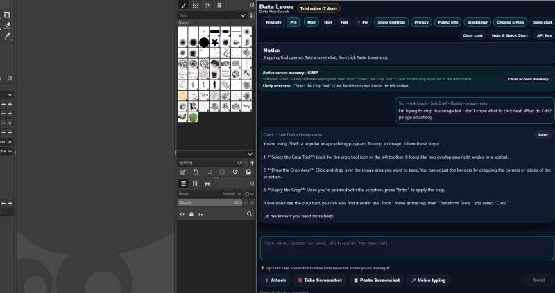
In this example, the screen is explained step-by-step so you know exactly what to do next instead of guessing.
You’re Not the Problem — The Software Is Just Not Clear
If a work screen feels complicated, it doesn’t mean you’re doing anything wrong. It usually means the software wasn’t designed to be easy to understand at first glance. Once you learn how to break it down—and get help when you need it—you can move forward with a lot more confidence.
What Makes Work Software So Hard to Understand?
Most work software isn’t designed for beginners. It’s designed for people who already know the workflow. That means:
- Important steps are hidden behind menus
- Buttons aren’t labeled in a way that makes sense right away
- You’re expected to already know what a “ticket,” “task,” or “dashboard” means
- The screen shows everything at once instead of guiding you step-by-step
So when you first open it, it doesn’t feel like a tool — it feels like something you’re supposed to already understand.
What This Looks Like in Real Life
You open a system at work and see:
- a dashboard full of numbers
- a list of tasks or tickets
- buttons you don’t recognize
- no clear “start here” point
You’re trying to do one simple thing, but the screen is asking you to understand everything at once. That’s why it feels overwhelming.
The Biggest Mistake People Make
The biggest mistake is trying to understand the entire screen at once.
That’s not how the software is meant to be used.
Instead, you only need to understand:
- what your task is
- where that task lives on the screen
- what the next action is
Everything else can wait.
When You Need a Clear Answer Fast
Sometimes, even after breaking things down, the screen still doesn’t make sense. That’s when guessing becomes risky.
Instead of clicking around and hoping for the best, tools like Data Levee let you take a screenshot of the screen and get a clear explanation of what you’re looking at and what to do next.
That turns a confusing screen into a clear next step.
- How to Figure Out What a Software Screen Means at Work
- What to Do When Instructions at Work Are Unclear
- How to Start a Task When You Don’t Know Where to Begin
- Try Data Levee for Confusing Work Screens